Base Style Guide
The Base System is a Visual Development Framework created for both designers and developers, aimed at helping them create clean, optimized, and scalable Webflow projects. It offers a set of standardized, reusable classes and layout frameworks that simplify the process of building enterprise-level websites and products that are easily understood by everyone on the team.
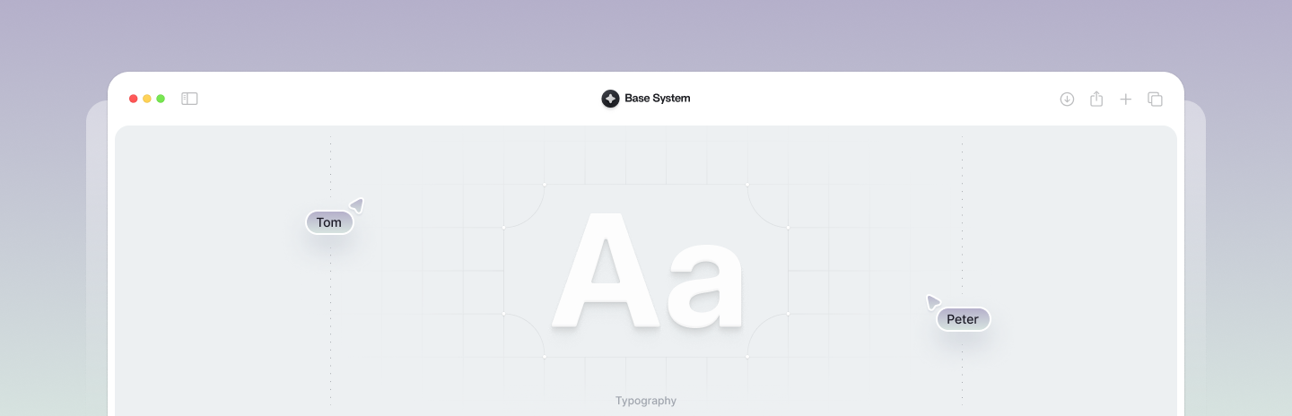
Headings
Browse the full documentation to learn more about headings.
The quick brown fox...
The quick brown fox...
The quick brown fox...
The quick brown fox...
The quick brown fox...
The quick brown fox...
Subheading
Browse the full documentation to learn more about subheadings.
Paragraph
Browse the full documentation to learn more about paragraph elements.
Lorem ipsum dolor sit amet, consectetur adipiscing elit. Nam sodales laoreet gravida. In eu faucibus felis. Cras aliquet urna dui, vitae vestibulum felis commodo in.
Lorem ipsum dolor sit amet, consectetur adipiscing elit. Nam sodales laoreet gravida. In eu faucibus felis. Cras aliquet urna dui, vitae vestibulum felis commodo in.
Lorem ipsum dolor sit amet, consectetur adipiscing elit. Nam sodales laoreet gravida. In eu faucibus felis. Cras aliquet urna dui, vitae vestibulum felis commodo in.
Lorem ipsum dolor sit amet, consectetur adipiscing elit. Nam sodales laoreet gravida. In eu faucibus felis. Cras aliquet urna dui, vitae vestibulum felis commodo in.
Lorem ipsum dolor sit amet, consectetur adipiscing elit. Nam sodales laoreet gravida. In eu faucibus felis. Cras aliquet urna dui, vitae vestibulum felis commodo in.
Overline
Browse the full documentation to learn more about overline elements.
Caption
Browse the full documentation to learn more about caption elements.
Text Weights
Browse the full documentation to learn more about text weights.
Other
Browse the full documentation to learn more about text alignments.
Buttons
Browse the full documentation to learn more about buttons.
Icon Buttons
Browse the full documentation to learn more about icon buttons.
Icons
Browse the full documentation to learn more about icons.
Badges
Browse the full documentation to learn more about badges.
Images
Browse the full documentation to learn more about images.

Sections
Browse the full documentation to learn more about sections and structure.
Containers
Browse the full documentation to learn more about containers and structure.
Spacing (Columns)
Browse the full documentation to learn more about spacing and columns.
Spacing (Rows)
Browse the full documentation to learn more about spacing and rows.
Max Widths
Browse the full documentation to learn more about max widths.
Grids
Browse the full documentation to learn more about grids and structure.
Title Wrappers
Browse the full documentation to learn more about title wrappers.
Utility Classes
Browse the full documentation to learn more about utility classes.
Background Colors
Browse the full documentation to learn more about background colors.